What is UI Design, and Why Does It Matter?
by Alexandra Atzl
I’ve always thought of User Interface (UI) Design as some sort of nebulous, abstract idea, encompassing visual design, information architecture, user experience, and above all, clear organization and navigation. In reality, it IS all of these things, to a degree. But most importantly, it involves thinking about your end user, and what you want them to accomplish on your site.
WhatCanI.Do, Singlebrook’s mobile fundraising platform (currently in free public beta), can provide a good example of how thinking in terms of UI Design can make an application or site more usable. This mobile web app allows people to donate to non-profit organizations in a quick, easy manner, right from their mobile device. There is a non-profit side to the application as well, where organizations can create WCID sites, publish them, and review their collected donations and donor information. This administrative side of WhatCanI.Do is currently undergoing several important user interface changes, which illustrate the larger significance of user interface design.
The Importance of Clear Page Titles
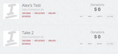
When a non-profit wishes to edit one of their WCID sites, they can click on an Edit Content link for that particular site, listed in the Non-Profit Dashboard. The page that loads, however, was originally titled Site Settings. What the user actually does on this page is alter their site title, description, main website url, and donation amounts—basically, the user is editing the site content. Hence, we updated the language to Edit Content, a clearer title that better conveys to the user what they can accomplish on that page. Site Settings could imply account settings, such as changing passwords or backend information about the site—and in this case, that would be an incorrect title for this page. You always want your page titles to accurately reflect the page contents—otherwise, you'll confuse users and make it extremely difficult for them to navigate your site.
Getting Users to Take the Action You Want
With any website, there is a clear purpose behind it, and a clear reason for its existence—you want users to buy your product, view your portfolio, share their thoughts with your community, etc. In the case of the non-profit side of WhatCanI.Do, our goal is to get those organizations to publish their sites. A non-profit user can create a site without publishing it, but it will not go live and be accessible to potential donors unless it is published. How could we better direct users towards this goal?


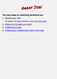
Our first step was to update the Next Steps page, which the user is sent to when they first create a WCID site. This page is meant to urge the user to publish, and alternately provide links for editing or previewing a site. The initial layout of this page did not highlight publishing at all, and as a result, it wasn’t clear to the user what their next step should be.
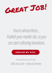
To remedy this, we updated the design of the page to include a large, eye-catching red button (which fit in with our existing visual design) urging a non-profit to publish. Call to action text explains to non-profit users that they must publish to start collecting donations. The alternate edit and preview links are included beneath, but in a lighter text color and smaller font. It is abundantly clear to the user what the obvious next step is.
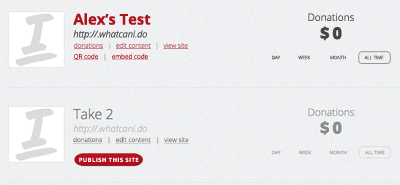
As a further edit, we are taking steps to better highlight a Publish link for each WCID site listed in the Non-Profit Dashboard. Published sites will be listed first, to highlight any recent donation activity, and will appear in a red color with edit, preview, and donations links. The unpublished sites will be grayed out slightly, with less prominent links, but they will each also include the large, red Publish button—a clear call to action, again urging non-profit users to publish their sites.


And of course, if all else fails, a message urging non-profits to publish their sites will appear at the top of the dashboard, if they currently have no published sites.
Rethinking User Flows
One thing I always find extremely helpful when thinking about UI design is how a user will flow between the pages of an application or site. In the case of WhatCanI.Do, the administrative (non-profit) side had an existing user flow that people were able to use—but there were aspects that needed to be improved upon.
For example, when first creating a site, non-profits were sent to the Next Steps page, where they had the option to publish or edit their site, or grab embed code to allow them to automatically redirect mobile users from their main website to their WCID site. However, if the site isn’t published yet, the embed code won’t work, right? It would send users to a page that doesn’t yet exist. So we eliminated this link, and instead placed it on the dashboard, ONLY for sites that are already published.
There was also the matter of where a non-profit user is sent upon login. Initially, WCID users were sent to the Next Steps page of their most recent site. But what if they wanted to edit one of their other sites? Or what if that particular site was already published? It didn’t make sense to send users to a page that would urge them to do something they had already done. Instead, our new user flow will send non-profits directly to their Dashboard upon logging in, where they can easily choose which site they need to work with.
As we roll out these UI changes for WhatCanI.Do, we hope to provide non-profits with an easier, more intuitive mobile fundraising experience.