Problem: An older website does not accommodate mobile devices
Himalayan Art Resources’s website (HAR) was launched in the year 1997. While it had grown and been updated in various ways over the years, it was becoming increasingly inaccessible as more and more users were using mobile devices to access the web.
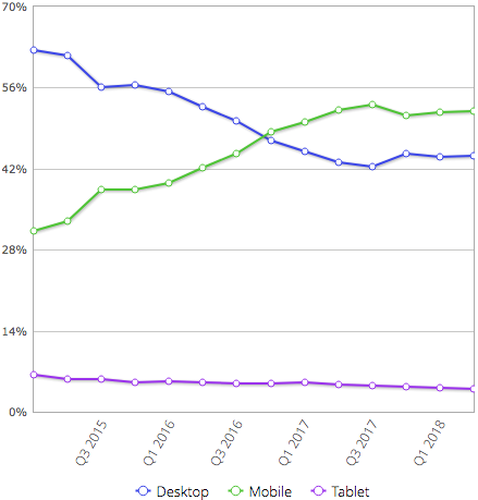
As the chart shows, handheld mobile devices became more popular for browsing the web than desktop computers around the end of 2016. Not only did they have smaller screens, but their touch-based interfaces required different designs than we had traditionally used for desktop browsers.
In addition to the usability issues for mobile users, “Mobilegeddon” had landed in early 2015. This change to Google’s algorithm meant that mobile device users wouldn’t even see HAR in their search results because Google (correctly) determined that it wasn’t mobile friendly. Since HAR’s mission is to provide an educational and research database to the world, it needed to be available and accessible to everyone on the web, including mobile users.
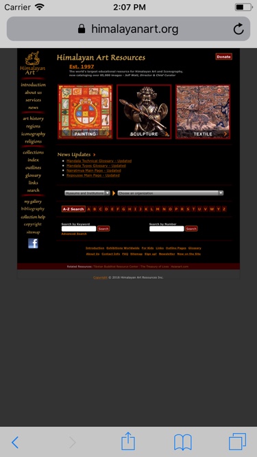
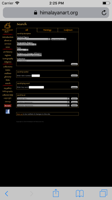
Before we began our big push for modernization, here’s what the HAR home page looked like on an iPhone. (Thanks to the awesome Wayback Machine for the old screen captures!) As you can clearly see, this was not good! Everything was too tiny to read, let alone tap, and we were not using the available screen real estate effectively.
Solutions: Responsive Design and Touch-friendly UI
We knew that responsive design was part of the solution to our problem. Responsive design is the art of presenting content so that it is usable, effective, and (hopefully) attractive on any size display, from a small smartphone to a large desktop monitor.
Another key component of the solution was to make the user interface touch-friendly. This involves making touch targets larger (i.e. at least fingertip-sized) and utilizing gestures such as swiping, pinching and zooming effectively.
Responsive Design
In service of the agile development principle of Early Value Delivery, and informed by HAR’s Google Analytics data, we tackled the most popular pages on the site first and launched each page as it was completed. (In contrast, a full site rebuild approach would have involved waiting to launch, and delivering no value, until the entire new site was ready.)
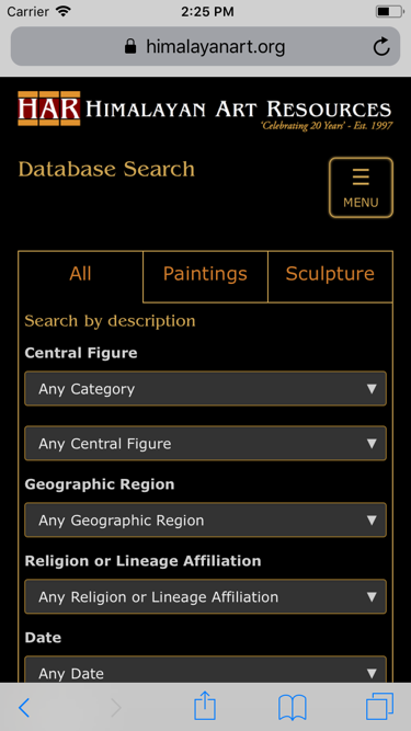
For each page on the site, we rebuilt the layout with a mobile-first mindset. Using Google Chrome’s handy Device Mode, we quickly and easily simulated a small mobile screen. We rearranged the page, leveraging Bootstrap’s responsive CSS framework, until it looked great on that small screen. From there, we moved up to three larger screen sizes, perfecting the layout for each screen size, and eventually stopping with a size that looked beautiful on widescreen laptops and desktops.
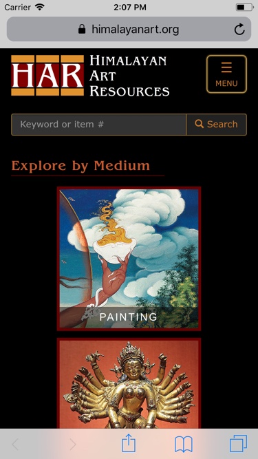
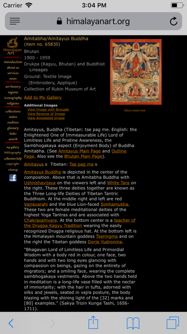
Check out these before-and-after iPhone screenshots of some key pages:

Touch-friendly UI
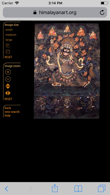
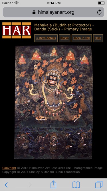
In addition to increasing the size of the links, form fields, and other controls on the site, we also considered which areas of the site would be improved by touch-friendly controls, such as dragging, pinching, and swiping. The primary candidate for improvement was the site’s image viewer, a tool which enabled zooming in on item images to see all of the tiny details present in the artworks.
The old image viewer looked like this, with awkward controls that were difficult for desktop and mobile users alike. It was also powered by old, unsupported, closed-source software, so we couldn’t maintain or improve it ourselves. Our only option was to replace it!
We built a new, touch-friendly image viewer using the excellent OpenLayers mapping library. It’s fast, intuitive, and offers a fantastic experience for desktop, mobile, and tablet users. (Psst… mouse over or tap to see it in action!)
Other Improvements
Along with the major overhaul described above, we’ve made a bunch of other improvements to the site, including:
- HTTPS/SSL encryption of site traffic, a must for all sites in 2018.
- Overhaul of the editing tools used by site admins to be responsive and streamlined, enabling them to work at optimal speed on cataloguing their huge collection of images.
- Replaced a large, unsupported, 3rd-party blog app (about 75,000 lines of code) with a small, focused, custom News feature (about 1,700 lines of code), reducing HAR’s code maintenance burden significantly.
- Used CSS’s unicode-range feature to automatically use the best-looking fonts for Tibetan and Chinese characters, wherever they appear on the site.
- Retina (high pixel density) screen support. This is a work in progress, but the site’s appearance continues to improve on modern mobile devices and desktops.
Results
Our quantitative results were impressive! As new pages were launched, we saw the number of pageviews increase by about 45%, which meant that HAR was doing a better job of fulfilling its mission. This can most likely be attributed to:
- HAR’s new, mobile-friendly pages were showing up in more Google searches by mobile users.
- Fewer users were dropping off quickly after arriving at the site. Our drop-off rates for the enhanced pages were down by anywhere from 15-80%. Mobile users were dropping off the home page only 10% as frequently as before!
Perhaps of equal importance, HAR has received a lot of great feedback about the changes to the site from their users and supporters.
If you own or manage an older website, please contact us today for a free, 30-minute consultation and find out how we can modernize your site and make it super mobile-friendly!